Making a Cover Image for Facebook Pages, Twitter Profiles, or Google+ Accounts that look great on the desktop is pretty routine now, but that desktop cover image doesn't look the same at all for mobile viewers. Cover Images can make a huge difference in social media performance. Here is how to make Cover Images that work for the almost all the platforms.
Desktop Web Dimensions Are Easy
The desktop web dimensions are relatively easy to build for - viewers see the whole 851x315 pixel area with a little bit at the bottom-left cut out for the Profile Pic and the Page information. The hardest part is finding images that work with the differing sizes Facebook, Twitter, Google+ AND YouTube all require. Desktop web is still the best place to start with Cover Image design, but the problems start as soon as you look at how users on mobile devices see the image.
Each Mobile Device Sees Something Different
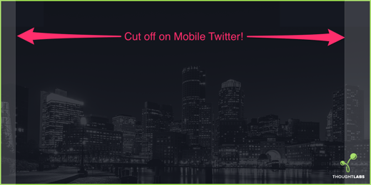
Sadly, mobile devices cut off portions of the image and render the Profile Picture and Page information in different places, and they even differ between Portrait and Landscape mode! Look at the picture at the top of this post - it is a desktop web sized image, with the text and profile picture positioning for Desktop, Nexus 5, iPad, and iPhone layered on top. The black bars on the side are what is cut off on most mobile devices - 35% of the total viewing area just isn't visible - and the Profile Pics and Page information take up a huge portion of the space at the bottom-left.
Here is the view of a Facebook Page cover image on the from the desktop and 4 popular mobile devices:

Design For Everyone
You can't control what someone will use to view your Facebook Page, but you can try to make sure that it still looks good for them. Here are three keys to making your image work:
- Center your image's key parts and text. The top center is viewable on all devices.
- Don't forget about the desktop. Even if roughly 145 pixels on each side aren't visible on mobile, they still are on the desktop. So, make sure that they have something to see as well.
- Test. Grab some devices and see what your covers look like. Make sure everyone gets a good experience.
Free Mobile Cover Image Templates
Want to get a head-start? Download our free mobile-friendly cover images for Facebook, Twitter, and Google+. They are easy to modify with your own cover image backgrounds and company information, and will let you preview how your covers will look on a variety of mobile devices right inside Photoshop.
Summary
Creating a mobile-friendly Cover Image just takes a little more work, but is worth it in a mobile-centric world. Have you found the same issues in designing your Cover Images?