"What the Heck is...?" is our new series about the most important updates and changes in social media and how it will affect YOUR goals, presence and ranking.
Focus on Photos
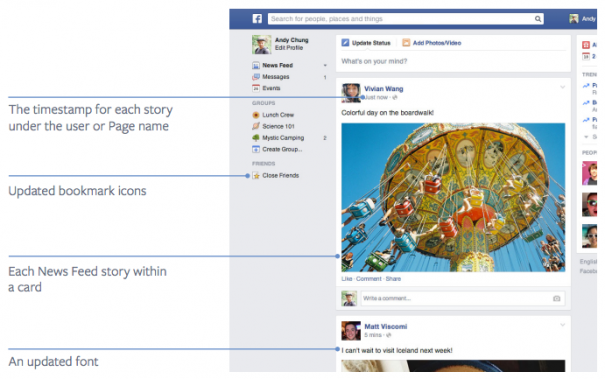
Facebook just announced another change to the New Feed - making the desktop version look more like the mobile version, with a focus on big photos. This follows their previous update, which focused on "High Quality" content. So, what the heck is this change and what does it mean for you and your business?
The social web, influenced heavily by Pintrest and Instagram, is slowly becoming more focused on visuals. As I am sure you have seen on your own Facebook Pages, visual posts are far outperforming text status updates, and even the unmodified link post format. As the News Feed becomes more and more crowded with brands trying to reach customers, great visual content is what will separate the wheat from the chaff.
The mobile versions of Facebook already have moved towards a larger visual focus. Last year, Facebook began to roll out a similar change to the desktop version with a new layout and big pictures, but initial feedback found that users found it difficult to navigate. So, Facebook pulled the change.
This latest update combines the larger visuals with the current layout, which should be the best of both worlds. This also has the advantage of not changing any requirements for ad sizes or images aspect ratios.
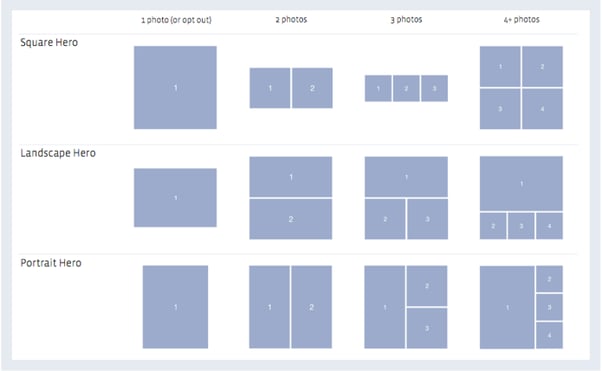
This update also adjusts the way that multi-photo uploads are presented. Depending on the number of photos added and the orientation, the display will either feature a photo or show them as squares. See below for a guide:
These changes will start rolling out today and continue throughout the month of March.
What Should You Do About it
Here are some steps you can do right now to take advantage of this change:
- Go visual. If you haven't already switched to using great photos and illustrations for your posts, start now. And use Facebook Ad friendly sizes, so that they display best in all uses. Use 1200x1200 for photo posts, 843x403 for photo highlights, and 1200x627 for link posts.
- Use images that match your brands style and tone. While there are a lot of photos on stock photo sites, most are likely not a good fit for the News Feed.
- Follow the 20% rule. It is easy to overlay a 5x5 grid over the photo in Photoshop to make sure text is only filling 5 squares. Following this rule will let you boost or promote in Ads. That 20% area is a great place for calls to action.
- Consider branding the image photos. Place a brand logo or slogan on the photos, so that it is still associated with you as it gets shared around.
Let us know what you think of the new News Feed and tips you have found that work well.
Tags:
Social Media NewsMar 5, 2014


