"What the Heck is...?" is our new series about the most important updates and changes in social media and how it will affect YOUR goals, presence and ranking.
Streamlined for Fans and Admins
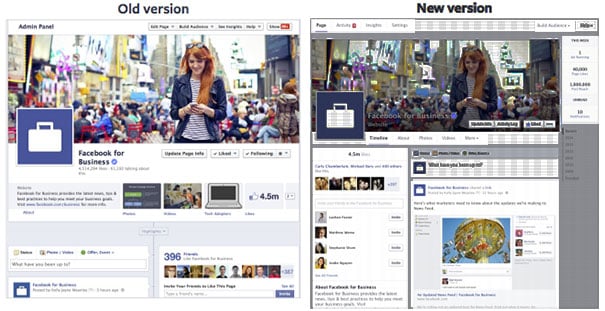
On the heels of the recent change to the News Feed, Facebook just announced an upcoming change to the layout for Facebook Pages. The change has two key focuses - making it easier for Fans to find what they want and helping admins find the tools they need. So, what the heck is this change and what does it mean for you and your business?
One Column Timeline
In the current version, posts alternate across two columns in the Timeline. While this allows users to see more posts, it doesn't match the design of their News Feed. Shifting to one column should make the posts easier to read and navigate, but might cut down viewing of older posts. The font size has been increased as well to match the News Feed.
Info on the Left
Page information, such as which friends are Fans, currently appear on the right side in the style of a post. In the new version, this information will move into a new left column that will also include business hours, maps, a short description of the page, and then photos and videos. This should make it easer to find key information for users, which means it is important to make sure Page information is updated.
Hidden Tabs
Pages can display 4 tabs right now, Photos, Likes and then 2 custom tabs, with all others hidden under a dropdown button. The new layout seems to hide all custom tabs behind a More dropdown. This is another disappointing step in reducing the value of tabs, as hidden tabs get virtually no traffic at all.
Important Cover Image Changes
This update places the Page name and category as an overlay on the cover image next to the profile picture. Unfortunately, this is done using white text, which means that all cover images will need to account for this in their design so that it can still be seen. The profile picture has also been moved up higher into the cover image, which will also cause some design issues. The size of the cover image and profile picture has not changed, however.
Admin tools up front
A new set of admin chrome has been added to the top and right side, allowing quick insights into how the Page is performing this week and easy access to key tools like Insights and Activity. This appears to be a more useful version of the expanding Admin panel that exists today.
Pages to Watch
Facebook is currently allowing some Pages to add others to a list for weekly comparison. This feature will be rolled out to everyone, and is a great way to quickly see how competitors are performing. Sadly, there is still no way to break out paid versus organic performance, so the numbers will be skewed for pages that are running ads. However, with the new pay-to-play system that the News Feed has evolved into, virtually everyone will be running ads in the future.
According to Facebook, the new layout will roll out to Pages in the next few weeks. Pages will be notified about the change and will have a few weeks to make changes before they are made visible.
What Should You Do About it
Here are some steps you can do right now to take advantage of this change:
- Give up on tabs. With the removal of the last visible location on the Page, and with the majority of engagement happening in the News Feed, tabs are no longer a good investment without advertising support to drive traffic.
- Update Page information. Make sure that the short page description, hours, and location are current.
- Prepare new cover image designs. While there aren't any templates yet for the new location of the profile picture and page name overlay, start creating new designs that can be easily modified to support them. Keep an eye out for how these covers appear on mobile, as that is where the majority of viewers will be coming from in the future.
Let us know what you think of the new Page layout and tips you have found that work well.
Tags:
Social Media NewsMar 11, 2014


