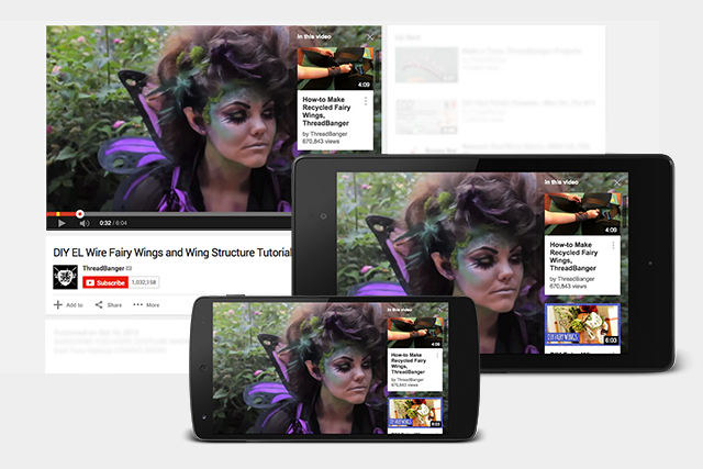
YouTube annotations have long provided brands a way to increase the interactivity of their social videos. However, the huge problem was that they didn't work on mobile devices ( currently supplying over half of all YouTube views. ) Thankfully, YouTube released "Cards" as a partial solution today, supporting mobile and adding new capabilities.
What Annotations are Good For
When annotations first came out, they were immediately used as a spamming tool by many channels asking viewers to subscribe or click to their website throughout the video. The annotations also looked bad most of the time. However, there were a few great uses for annotations:
Adding Contextual Information
Much like the Pop Up Video version of Lost, annotations allow the video creator to give the viewer more information about what they are watching. This could be other videos that help to explain a key point or a link to the creator's blog post on the subject.
Example: In the video below, at 0:24, Rob uses Spotlight Annotations to add links to all the equipment he uses so viewers can learn more about the instrument and how he uses it.
Providing a Table of Contents
Most videos lose the majority of their viewers in the first 10 seconds, so longer videos have a much harder time getting viewers to watch the most useful parts. Annotations can help to provide a simple navigation mechanism, like a Table of Contents, enabling users to skip directly to what they want to watch.
Example: In the video below, at 0:14, the Table of Contents is shown with annotations that link back to the same video with a time offset. At the top of the video, he has also provided a quick link that jumps the viewer back to the table of contents from wherever they happen to be at the time.
Driving Traffic to Related Videos
There is usually an "End-Card" at the last 15 seconds of most videos from the top YouTubers that showcases other videos they have produced. Usually, mini-clips of each video are included and then overlayed with Spotlight annotations that link to those videos. The previews make the links far more attractive to click and help to control what the viewers watch next.
Example: In the video below, at 0:14, the Table of Contents is shown with annotations that link back to the same video with a time offset. At the top of the video, he has also provided a quick link that jumps the viewer back to the table of contents from wherever they happen to be at the time.
Sadly, none of the above work on mobile devices, which means they are becoming less useful daily as mobile traffic grows.
What The New Cards Can Do Well
Cards are not yet a replacement for Annotations, although YouTube has said that is their eventual goal. The biggest change is that they work roughly the same across desktop and mobile

Cards are placed in the video timeline just like annotations. When their time comes, the Card's title appears with a small "i" next to it. The user can then bring up the Card by clicking/tapping on it. Like annotations, there are several types of Cards, but the format of each "Card" is the same - a large image with a title and some text. If the user doesn't click on the title, it fades away after a few seconds. However, clicking on any Card title brings up a viewer with all the Cards that appear in the video.
Cards Work Really Well For Context
With their time-based appearance, Cards let the video creator share additional information for the viewer outside of the video. Instead of using Spotlight annotations that transparently wrap portions of the video, each Card can use its own image and description to provide quick details and link to an external site for more information.
Example: In the video below, at 0:08 and other places, Burberry links to videos with details on different aspects of the show, such as guests, nails, performances. (Their use of Play as the title is again a little vague.)
Cards Can Drive Traffic
With their own image, title and description, cards can work like mini-ads with Calls-To-Action. Because you can use up to 5 Cards per video, that is 5 opportunities to let viewers know about a related book, product, video, or website.
Example: In the video below, at 0:03, a Learn More title appears in the top right. Clicking it reveals a Card asking viewers to create and share their own 4x4 videos. (Learn More is probably not the best title for this, however.)
Cards Can't Replace Annotations Yet
As good as they are, Cards aren't ready to replace annotations yet:
- Cards can't link back to their host video, eliminating the Table of Contents and other in-video interactions
- You can only have 5 Cards, which may be a big limit for some types of engagement.
- You can't create "End-Cards" for videos, since only 1 card is shown at a time and they don't overlay the videos
The good news is that you can use them both at the same time. So, experiment with Cards for adding new interactivity and continue to use annotations for the rest.
Tips for Cards
Here are some quick tips and caveats for using Cards:
- Do more than link to a website. Provide a real benefit for viewers who are watching the video. It may still be an link to a website, but make it relevant. Explore some of the other options.
- Don't point to Cards in the video. Each device may position them differently.
- Know what gets disabled. Using Cards disables "Featured videos" and Call-to-Action overlays. If you need these, you can't use cards.
- Mobile isn't identical. Some mobile viewers, like the iPhone, chop off the end of Card titles, while they are fully displayed on desktop and other devices. So, test and tweak your Cards on multiple devices.
- Space them out. Since only one Card title appears at a time, give each one a time to shine.
Will you use Cards in your videos? What aspect appeals to you most?
Mar 16, 2015


